Pitney Bowes Knowledge Communities
A knowledge community is community construct, stemming from the convergence of knowledge management as a field of study and social exchange theory.
UX Consultant
UX Manager
Industry
Software Development
10,000+
Background
I was tasked to revamp the Knowledge Communities website for Pitney Bowes.
Pitney Bowes' knowledge community offers users a collaborative space to share expertise, solve problems collectively, and stay abreast of industry trends. Members benefit from a dynamic learning environment, fostering innovation, and gaining insights for professional growth within the company.
Goals
Streamline Usability.
Key Feature Prioritization.
Integration with Daily Workflows.
Cultivate a culture of innovation within the community.
Design Strategy Methodology
In formulating the design strategy, I initiated by comprehensively assessing the existing state of the Pitney Bowes knowledge community page. As a consultant, a thorough understanding of the current version was imperative, prompting me to commence with a heuristic evaluation to unravel its functionality and user experience intricacies.
Heuristics Evaluation
The main purpose of this evaluation is to assess the usability of the Knowledge Community website for Pitney Bowes. Heuristics helps to evaluate the issues related to flow, efficiency, content as per usability standards.
I collected both positive and negative findings.
I ranked the severity of each negative finding using this scale: On a scale of 1-4, 1 is cosmetic, 2 is a minor, 3 is major and 4 is catastrophic.
I did not ranked positive findings.
Heuristic
Negative Findings
Positive Findings
H1. Visibility of system status
0
2
2
1
0
0
0
0
10 Total
6 Total
2
3
3
0
0
0
0
0
1
1
0
1
H2. Match between system and the real world
H3. User control and freedom
H4. Consistency and standards
H5. Error prevention
H6. Recognition rather than recall
H7. Flexibility and efficiency of use
H8. Aesthetic and minimalistic design
H9. Help users recognize, diagnose, and recover from errors
H10. Help and documentation
Table to summarize Heuristic Evaluation
Negative Findings
User Control and Freedom: All Communities Page
When user tries to apply any filter, it takes the user to Login Popup, and when user goes back then filter shows that it's applied yet the content is same as earlier.
Recommendation: If we don't want to apply Filters (in case of Non-Logged in user), then at least don't show “filters applied state”.
Match between system and real world: Home Page
Right side bar to Login - There is no need to do that as the intend and communication is not right there.
Recommendation: We can have a login widget or if we want to have the same side bar, we will need to change the copy as action is not clear.
User Control and Freedom: Home Page
First fold crousels- No need to give Play/Pause buttons.
Recommendation: As we already have previous/next arrows in the crousels, we can get rid of the play/pause button.
Competitive Analysis
As a consultant, I prioritized gaining insights into competitors' strategies before shaping any design decisions. To achieve this, I initiated a comprehensive competitive analysis, seeking to identify and align with industry standards.
Apple
Samsung
Dell
Microsoft
Feature
Search
Yes
Yes
Yes
Yes
No
No
No
No
No
No
No
No
No
No
No
No
No
No
No
No
Yes
Yes
Yes
Yes
Yes
Yes
Yes
Yes
Yes
Yes
Yes
Yes
Yes
Yes
Yes
Yes
Yes
No
No
No
No
No
Yes
No
No
Profile -yes
Speciality, Award - yes
Follower/Following - no
Profile -yes
Follower/Following - no
Profile -yes
Follower/Following - no
Community Description (Home)
Latest Posts/Stories
Member of the Week
Search (within community)
Labels in Chats
Follow a Member
Member Profile - Activity, Achievements, Followers. Following)
Videos
Sub Communities
Lounge Area (Hobby, Cooking, Camera)
Featured Videos
Table to compare competitors features'
Recommendations
For Home Page:
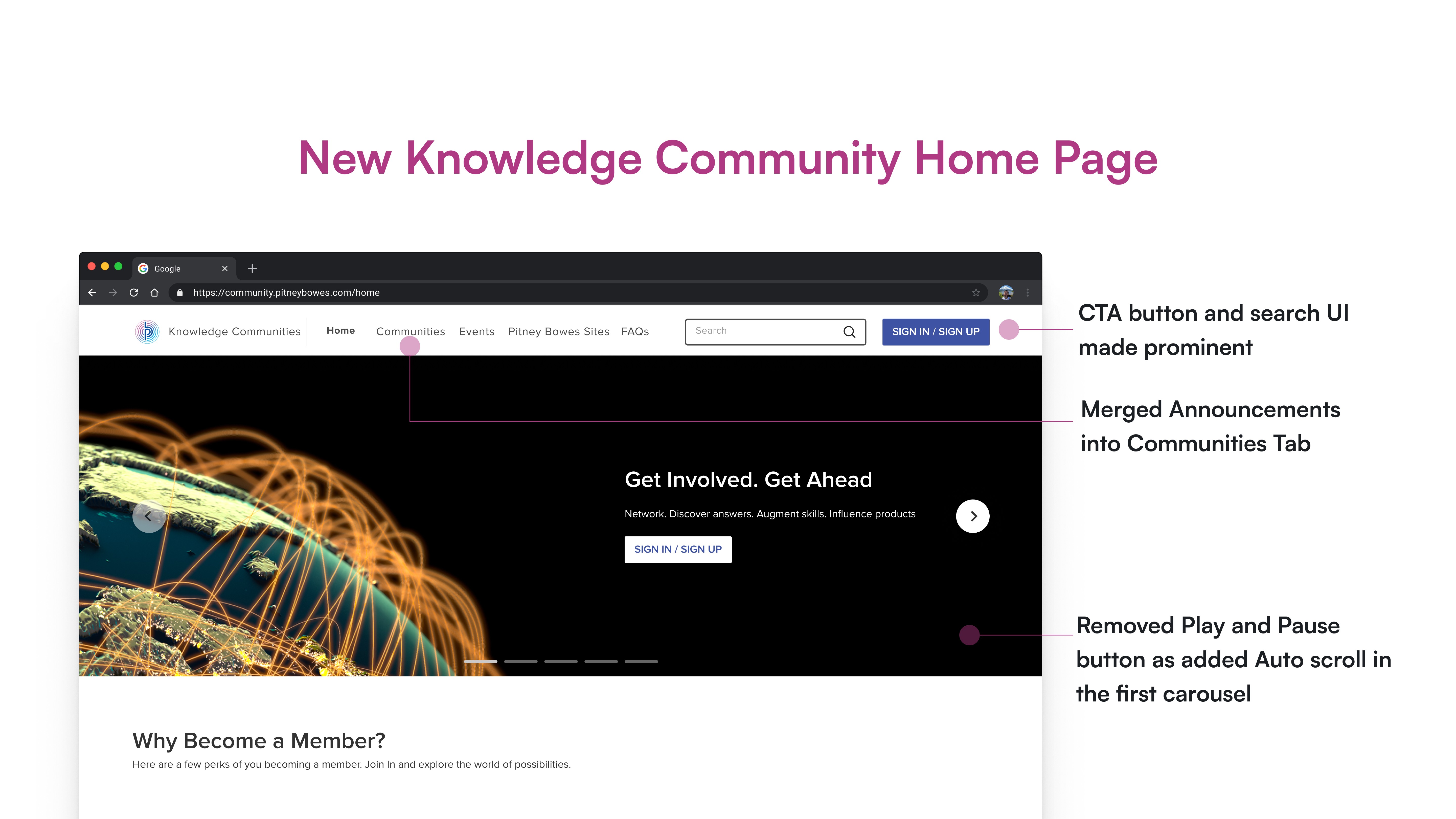
We can merge the Announcements tab as - Announcements takes user to “Community Announcement & Information”.
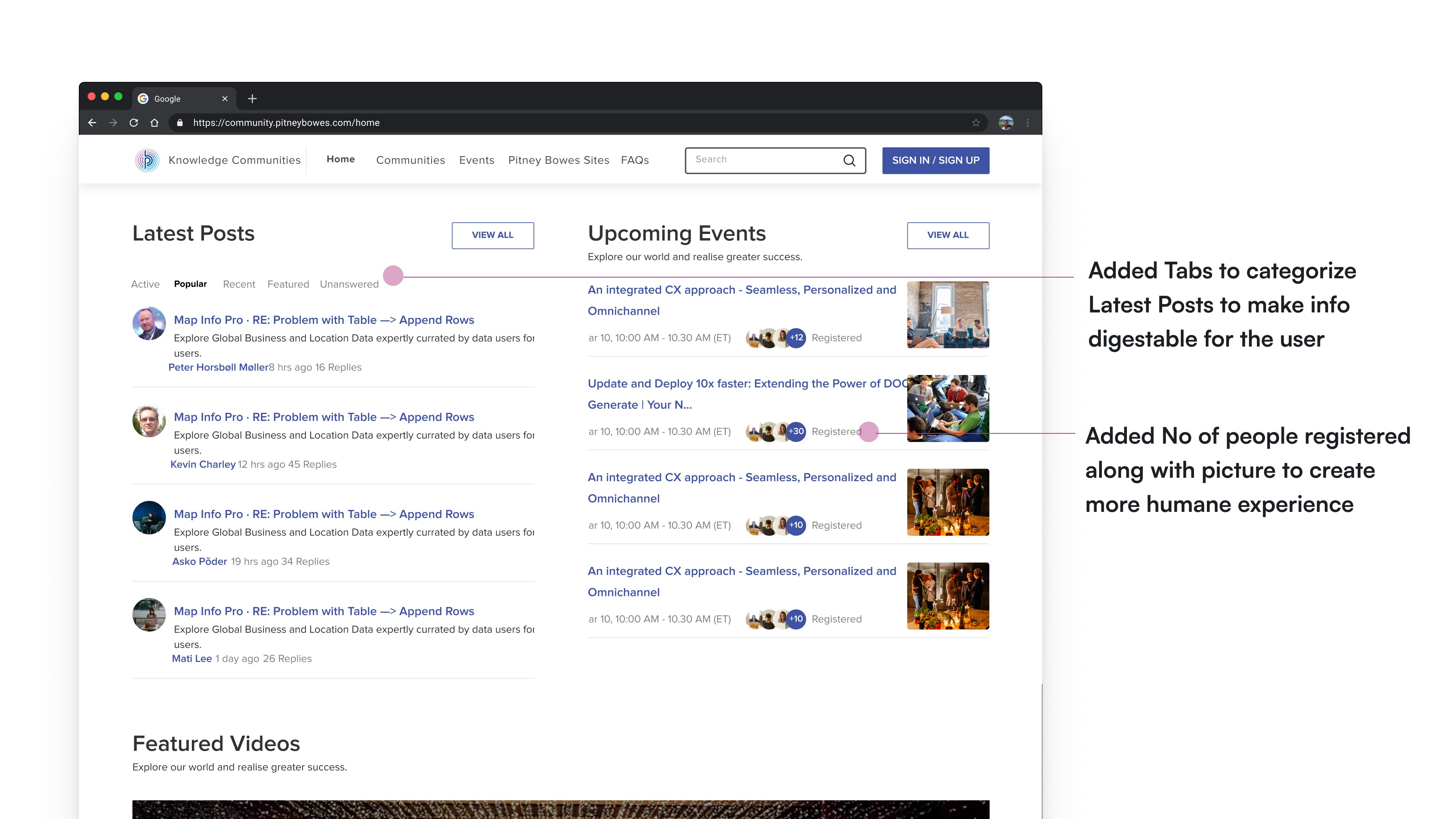
If there are no upcoming events, we don't need to show the no result found message instead we can leverage that spot and ask users “Want to Get Latest Updates of the Upcoming Events?” Sign Up now to be the first to know! This can help in increasing the number of Logged in users hence creating a broader, stronger, and more tightly knit community.
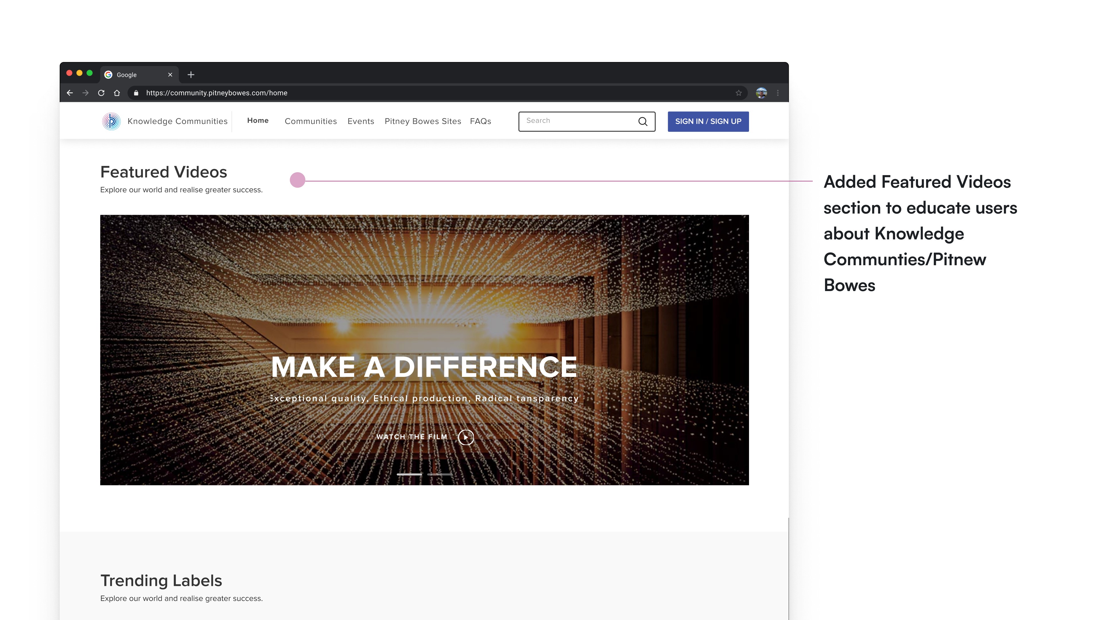
We can have “Featured Videos” section where we can add tutorials about the new features launched in a product or new product launches.
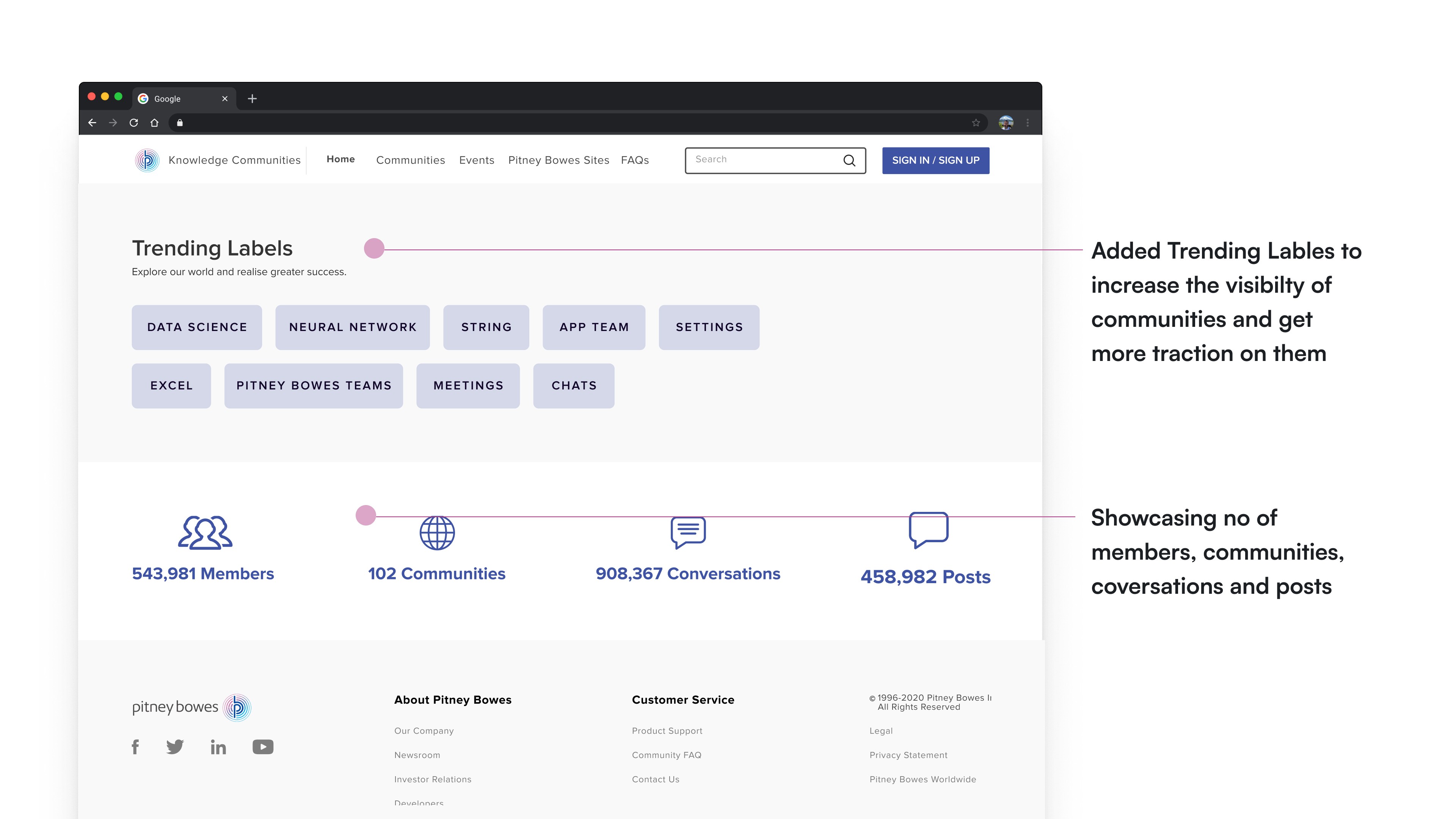
We can add statistics section in the bottom which tells the user about our knowledge community - How many members are there in our platform, how many communities are there, how many conversations and posts have been made.
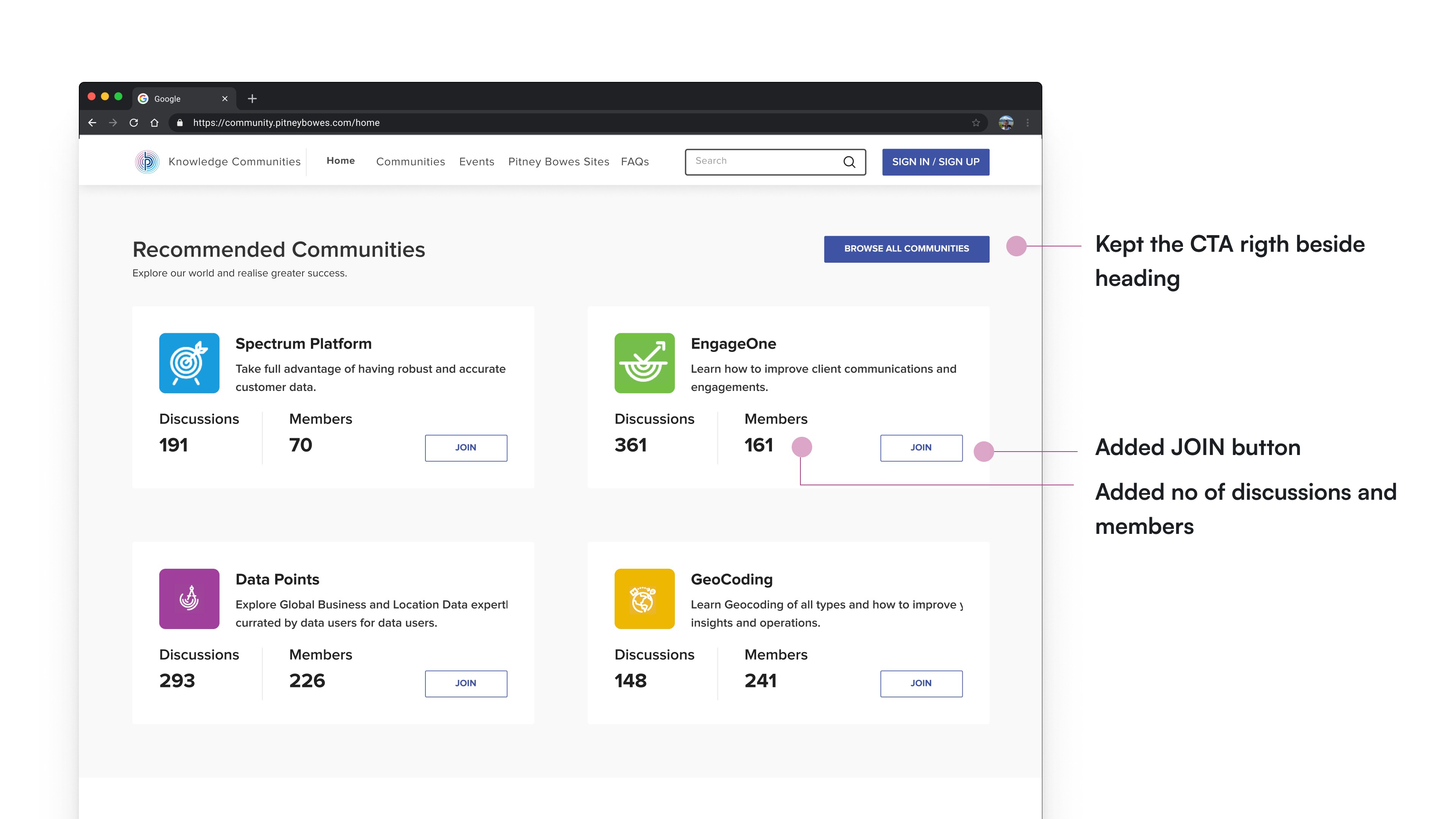
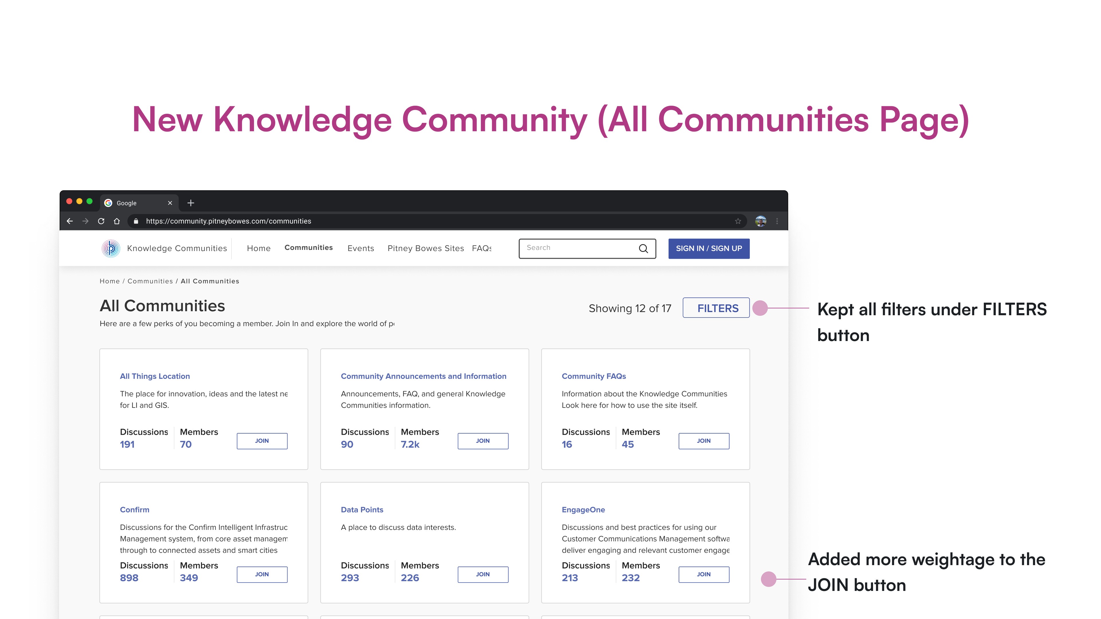
In the Recommended communities section there is no information about the discussions or the number of members in a community. We should add that in the communities card.
We can also give “JOIN” button so that the user can join the community right from the home page and it can save one extra click to the user.
For All Communities Page:
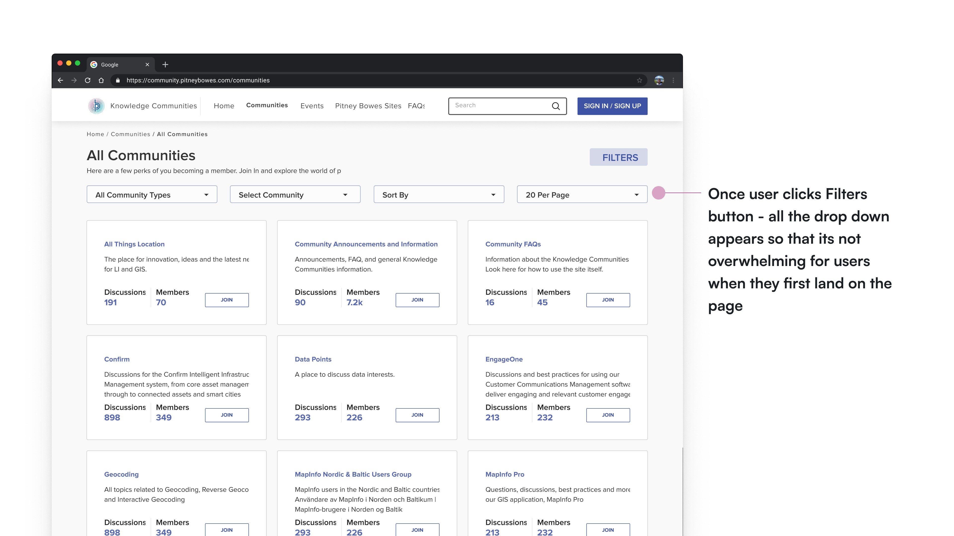
We can improve filters in this page, in terms of usability by introducing check boxes to the options so that the user can select more than one parameter in a go.
By introducing checkboxes we can get rid of one parameter “Communities to which I belong and can join” as the user can select both these cases in the checkboxes given below.
Criticality Analysis
Criticality analysis in UX involves identifying and prioritizing crucial elements in a user interface to optimize user satisfaction and task performance, ensuring focused design efforts.
Solution Analysis Process: Explored multiple potential solutions for the project.
Utilization of Criticality Chart: Employed a criticality chart for a systematic analysis.
Four Quadrant Segmentation:
Top right quadrant: Solutions deemed both critical and frequent.
Top left quadrant: Solutions identified as critical but not frequent.
Bottom right quadrant: Non-critical yet frequent solutions.
Bottom left quadrant: Solutions categorized as neither critical nor frequent.
Structured Evaluation Framework:
Introduced a methodical approach for evaluating solutions.
Framework based on the dual criteria of criticality and frequency.
PITNEY BOWES SITE
DISCUSSIONS
POSTS
LIKES
SIGN UP
SHARE EVENT
SHARES
ANNOUNCEMENTS
FAQs
EVENTS
MEMBERS
COMMUNITY
SEARCH
(Critical, Frequent)
(Non Critical, Frequent)
(Non Critical, Non Frequent)
(Critical, Non Frequent)
Criticality Analysis Graph
Information Architecture
Information Architecture Restructuring:
Utilizing insights from the criticality analysis, I reorganized the information architecture of the site.
Specifically, I incorporated the "Community Announcements" category under the "Community" tab for a more cohesive user experience.
Enhanced Sign-In/Sign-Up Flows: Addressing user confusion, I streamlined and clarified both the sign-in and sign-up processes, ensuring a more intuitive and user-friendly navigation.
Featured Communities:
To highlight key communities, I revamped the interface to showcase the top 5 communities prominently on the homepage.
Additionally, I introduced a "Browse All Communities" tab to enhance overall visibility and accessibility.
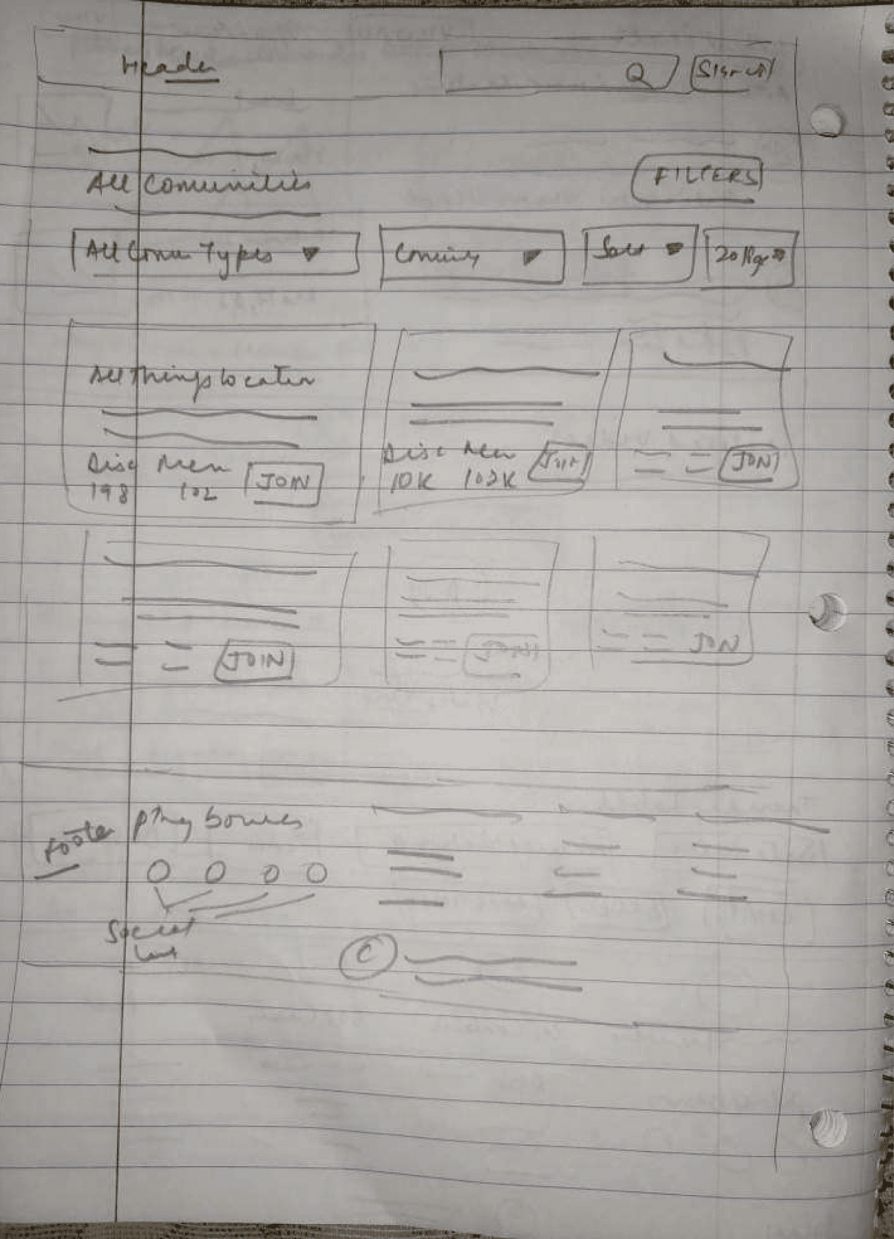
Communities
All Communities
My Communities
Product Communities
Special Interest Communities
Community FAQs
Community Announcements and Infornmation
Recommended Communities
Spectrum Platform
Engage One
Data Points
Map Info Pro
Geo Coding
Browse All Communities
View All
Search
Search Results
Sign Up/Sign In
Latest Posts
Post 1
Post 2
Post 3
View All
Email id
Password
Forgot Password
Email Address
Confirm Email Address
Help Us Improve
Upcoming Events
Sign In
Listed Events
Sign Up
PB Site
HOME PAGE
Information Architecture
Wireframes
Information Architecture (IA) Decisions:
Merged the "Community Announcements" tab seamlessly under the "Communities" section for enhanced cohesion.
Wireframing Goals for Home Page and All Communities Page:
Prioritized visibility of the "Sign In" button both on the navigation bar and the home page.
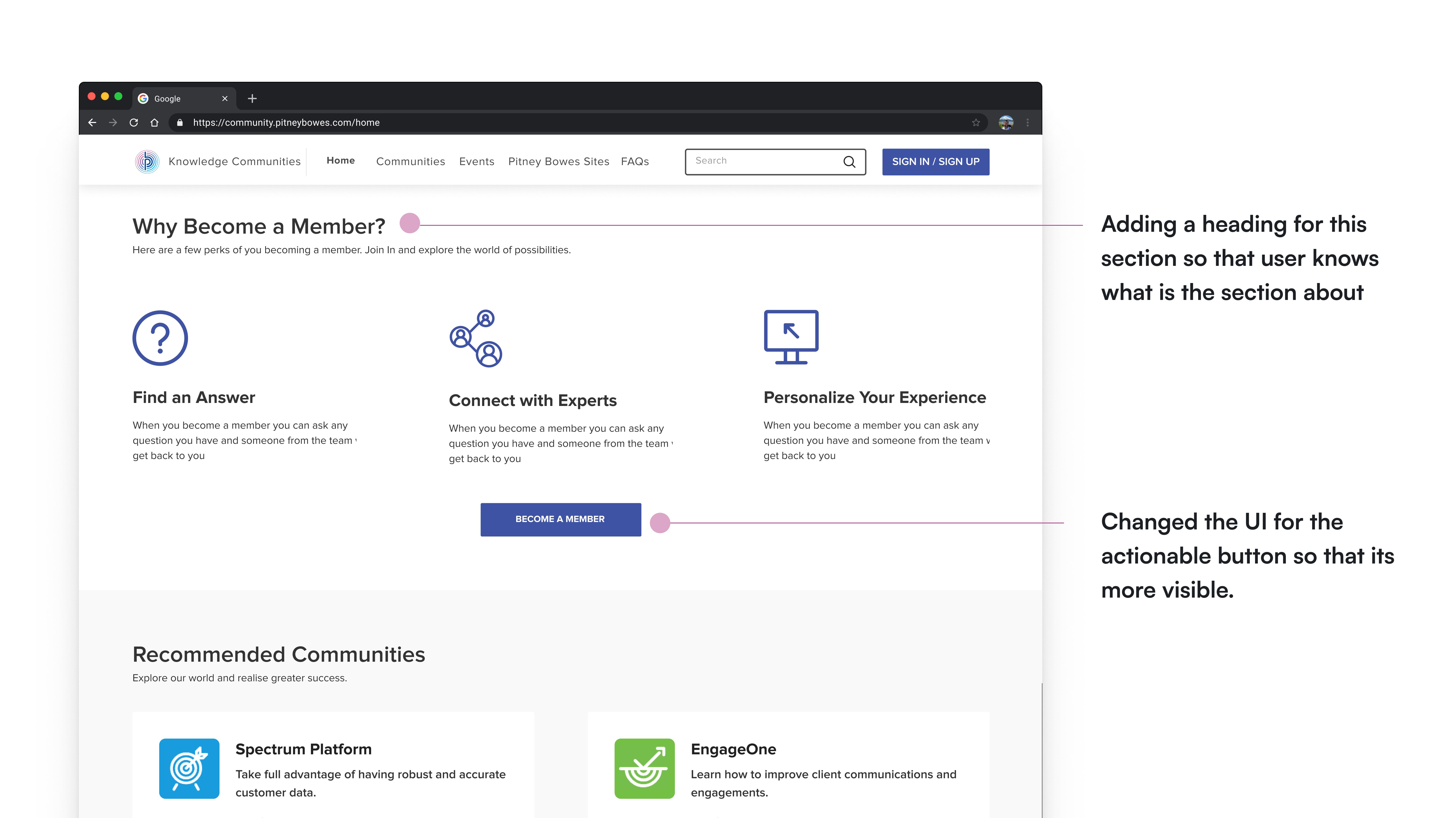
Focused on promoting user engagement by emphasizing the benefits of becoming a member, accompanied by a clear and prominent "Join" button.
User Engagement Strategies:
Crafted wireframes that provide concise explanations under relevant headings to guide users seamlessly.
Highlighted the current active member count and showcased active communities to bolster a sense of community vibrancy.
All Communities Page Optimization:
Implemented a streamlined approach by consolidating filters under a single tab for improved user experience and clarity.
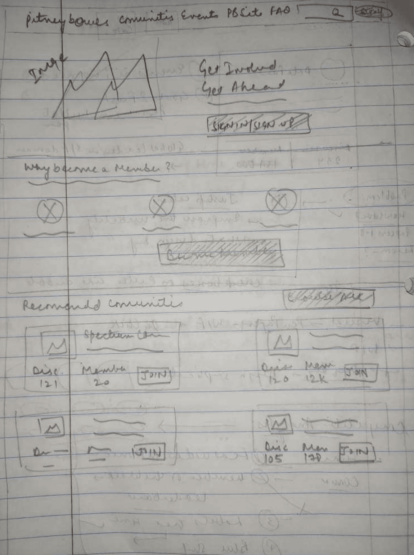
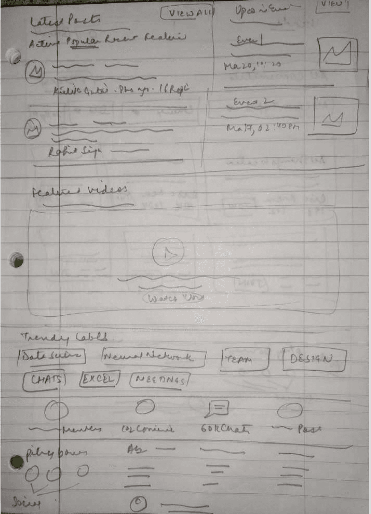
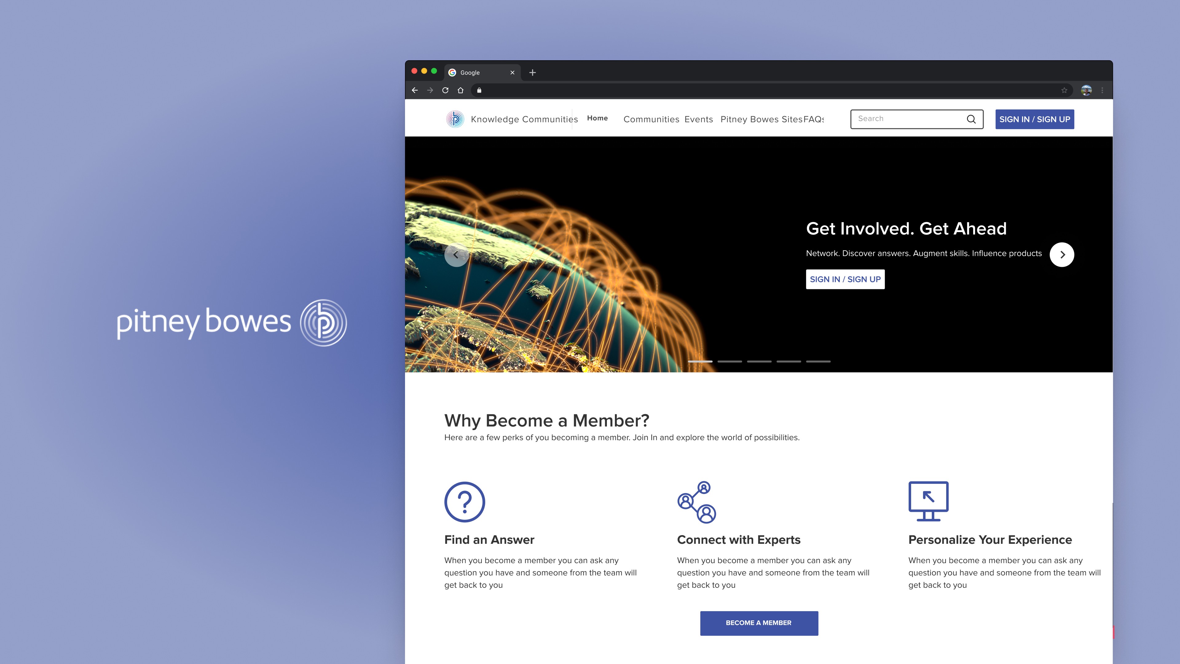
Left to Right - Home Page, Home Page (second scroll), and All Communities Page
Visual Design
Implemented a prominent "Sign In" button strategically to drive increased signups.
Emphasized and highlighted the benefits of membership to encourage more users to sign up.
Improved visibility of top communities, enhancing user awareness and engagement.
Enhanced affordance for users to easily join communities, contributing to improved usability.
Home Page -first fold
Home Page - second fold
Home Page - third fold
Home Page- fourth fold
Home Page - fifth fold
Home Page - sixth fold
All Communities Page
All Communities Page - after clicking Fiters
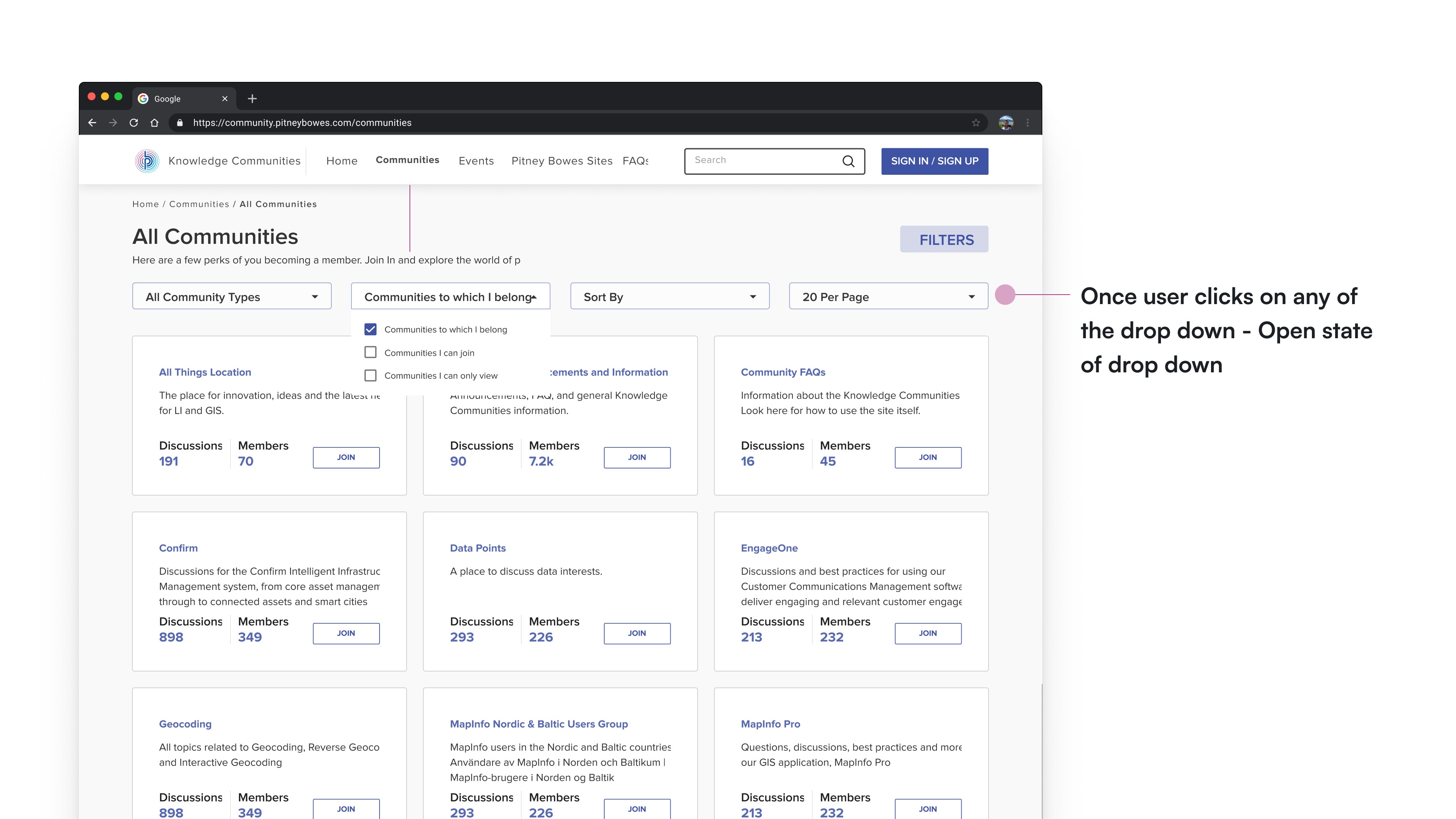
All Communities Page - after clicking Fiters , drop down expanded
Potential Design Impacts
By proposing the above mentioned changes we would be able to make the overall user experience seamless. Providing the right information would help more and more users to get onboard. The proposed solution will make the site more accessible. Now user can easily understand why he/she should become member.
By enabling users to Join the community even from the Home, will decrease the number of click and as a result make the user journey shorter, simpler and easy. We also introduced multiple check boxes to choose while filtering the communties. We also added no of people registered in an event to make it more clear and transparent for the user. As a result of all these changes, the overall user journey and navigation becomes shallow and simple.
Reflections and Learnings
I learnt how to strike a balance between research and design while working under tight deadlines.
I learnt how to make use of the limited resources we have as ux designers sometimes, in order to create aesthetic and functional experiences for humans.


